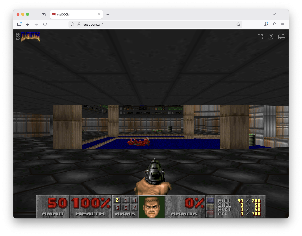
No, CSS is awesome. CSS is better than ever and it is only getting better. And that is why I built DOOM in CSS. Every wall, floor, barrel, and imp is a <div>, positioned in 3D space using CSS transforms. The game logic runs in JavaScript, but the rendering is entirely CSS. You can play it right now.
Why? Because I wanted to find the limits of what a browser can do. See how powerful modern CSS is. And because it’s DOOM. In CSS. Do you really need more of a reason?
So, modern CSS is awesome. The fact that you can even build something like this is proof how much CSS has progressed in the last 30 years. But that does not mean I did not run into problems.
The idea of this project started when I build a version of DOOM that ran on my old 1980’s oscilloscope. So a lot of the initial problems were already solved. I had the code to extract maps from the original game and a good idea about the math involved.
The first proof-of-concept I created was completely hand crafted and was created around the idea of doing as much as possible in CSS, even game state, game logic and calculations. Now that didn’t turn out to be feasible. Rendering? Yes. Absolutely. Game state… yeah, you could if you wanted to. Logic? No. Too complicated. So I split the project in two. Once I’ve proven to myself that rendering was feasible, I used Claude to create an approximate version of the game loop in JavaScript based on the original DOOM source, which to me is the least interesting part of the project. The C code is public and has been for years, so nothing new and challenging about that. So why waste time porting that over by hand. This allowed me to focus on the best parts: the CSS.
I’ve published the code on Github, but I’d like to explain a bit about how it works and what issues I’ve run into along the way.
So how does it work?
Back to high school
DOOM not only transports me back to a time when I was in high school, but when I started with planning this out it also brought back a lot of high school maths. Let’s start at the basics.
We use the same data the original DOOM engine uses: vertices, linedefs, sidedefs and sectors, all extracted from the original WAD file that came with the shareware version of the game back in 1993. And with this data we create a static scene out of a couple thousand <div> elements and let the browser do all of the hard work.
<div class="wall" style="
  --start-x: 2560;
  --start-y: -2112;
  --end-x: 2560;
  --end-y: -2496;
  --floor-z: 32;
  --ceiling-z: 88;
">
And we’re not just calculating everything in JavaScript. Each wall gets its raw DOOM coordinates as custom properties, such as two pairs of x/y coordinates and the floor and ceiling heights. We don’t set the 3D transforms or width and height of the element directly. CSS calculates everything else based on the data we get from the WAD file.
The width of the wall? That’s good old Pythagoras on the delta between start and end coordinates. The rotation? That’s the inverse tangent on the delta between the two sets of coordinates. I think a big thank you to my high school math teacher is in order, because I still remembered how to do this after more than 30 years.
All the geometry math happens in the browser’s CSS engine. And as luck would have it, we have CSS functions for both of these formulas. We can use hypot() and atan2() to get our width and angle. Actually that is not luck. Those formulas were deliberately added to make it easier to do these kinds of calculations.
.wall {
    --delta-x: calc(var(--end-x) - var(--start-x));
    --delta-y: calc(var(--end-y) - var(--start-y));

    width: calc(hypot(var(--delta-x), var(--delta-y)) * 1px);
    height: calc((var(--ceiling-z) - var(--floor-z)) * 1px);

    transform:
        translate3d(
            calc(var(--start-x) * 1px),
            calc(var(--ceiling-z) * -1px),
            calc(var(--start-y) * -1px)
        )
        rotateY(atan2(var(--delta-y), var(--delta-x)));
}
JavaScript passes raw DOOM data in. CSS does the trigonometry. That separation was for me the right balance between JavaScript and CSS. JavaScript runs the game loop. CSS does the rendering.
In the code we also have this strict separation. The game loop is completely separate with a separate game state. The game loop then calls JavaScript functions in the renderer, which acts as a very thin layer around the CSS. It basically sets custom properties, classes and spawns new HTML elements.
The coordinate problem
DOOM’s coordinate system doesn’t map directly to CSS 3D. DOOM uses a top-down 2D system where Y increases going north. CSS 3D has Y going up and Z going toward the viewer. But other than that we do not have to do any conversion between the two coordinate systems.
This is the reason why you see me using translate3d(x,-z,-y) instead of translate3d(x,y,z), because our custom properties are in DOOM coordinates, while the transform needs CSS coordinates.
There’s one particularly satisfying result: the rotateY(atan2(var(--delta-y), var(--delta-x))) on walls. Because DOOM Y maps to negative Z, and CSS rotateY() rotates around the vertical axis, the raw DOOM deltas feed directly into atan2() without any additional conversion. The math just works out. Don’t worry if you don’t get it. I’m not even sure if I get it. It works. Trust me.
Moving the world, not the camera
I don’t have any experience with rendering in 3D. And what I remembered from the few times that I used 3D modeling software was that you have a camera, that you can move and animate. But CSS doesn’t have a camera. So we do a trick: we move the entire world in the opposite direction of the player. We move the world around the player. Which turns out to be one of the classic tricks of how this is done.
JavaScript sets just four custom properties on the viewport: --player-x, --player-y, --player-z, and --player-angle. CSS does the rest:
#scene {
    translate: 0 0 var(--perspective);
    transform:
        rotateY(calc(var(--player-angle) * -1rad))
        translate3d(
            calc(var(--player-x) * -1px),
            calc(var(--player-z) * 1px),
            calc(var(--player-y) * 1px)
    );
}
If you compare the translate3d() with the one for the walls, you’ll notice that it is now the inverse. Instead of translate3d(x,-z,-y) we now use translate3d(-x,z,y). This is because we’re moving the world in exactly the opposite direction. If we do a step forward, we’re moving the world backwards. If we go up the stairs, we’re moving the stairs downwards. Everything is in reverse.
That first translate: 0 0 var(--perspective) is a subtle but important detail. CSS perspective positions the viewpoint a certain distance away from the scene. Without compensating for that, the entire world appears too far away. So we shift the scene forward by exactly that amount. That took a bit to figure out. One other detail is that we’ve kept it separate from the main transform by using a standalone translate property instead of using a translate() function on transform, which allows for smoother transitions between different camera standpoints, but we’ll get back to that.
Moving and looking around is just updating four custom properties. That’s it.
Floors are divs, tipped sideways
DOM elements are vertical by default — they exist in the x/y plane. Floors need to be horizontal. So every floor gets a rotateX(90deg) to tip it from vertical into the horizontal plane.
.floor {
    transform:
        translate3d(/* position */)
        rotateX(90deg);
}
It has to be positive 90 degrees, not negative, because we need the div to extend forward in the z direction. I got that wrong the first time. The floor was there, just facing the wrong way, so it was invisible from the player’s viewpoint.
DOOM’s floors aren’t rectangular. Sectors can be any polygon — L-shapes, irregular rooms, circular-ish curves. For those we use clip-path with polygon() to cut the rectangular div into the right shape. Some sectors even have holes in them — pillars, platforms or windows — and for those we use clip-path with path() and the evenodd fill rule. That lets us draw an outer boundary and inner cutouts in a single SVG path, with the browser drawing only the areas enclosed an odd number of times.
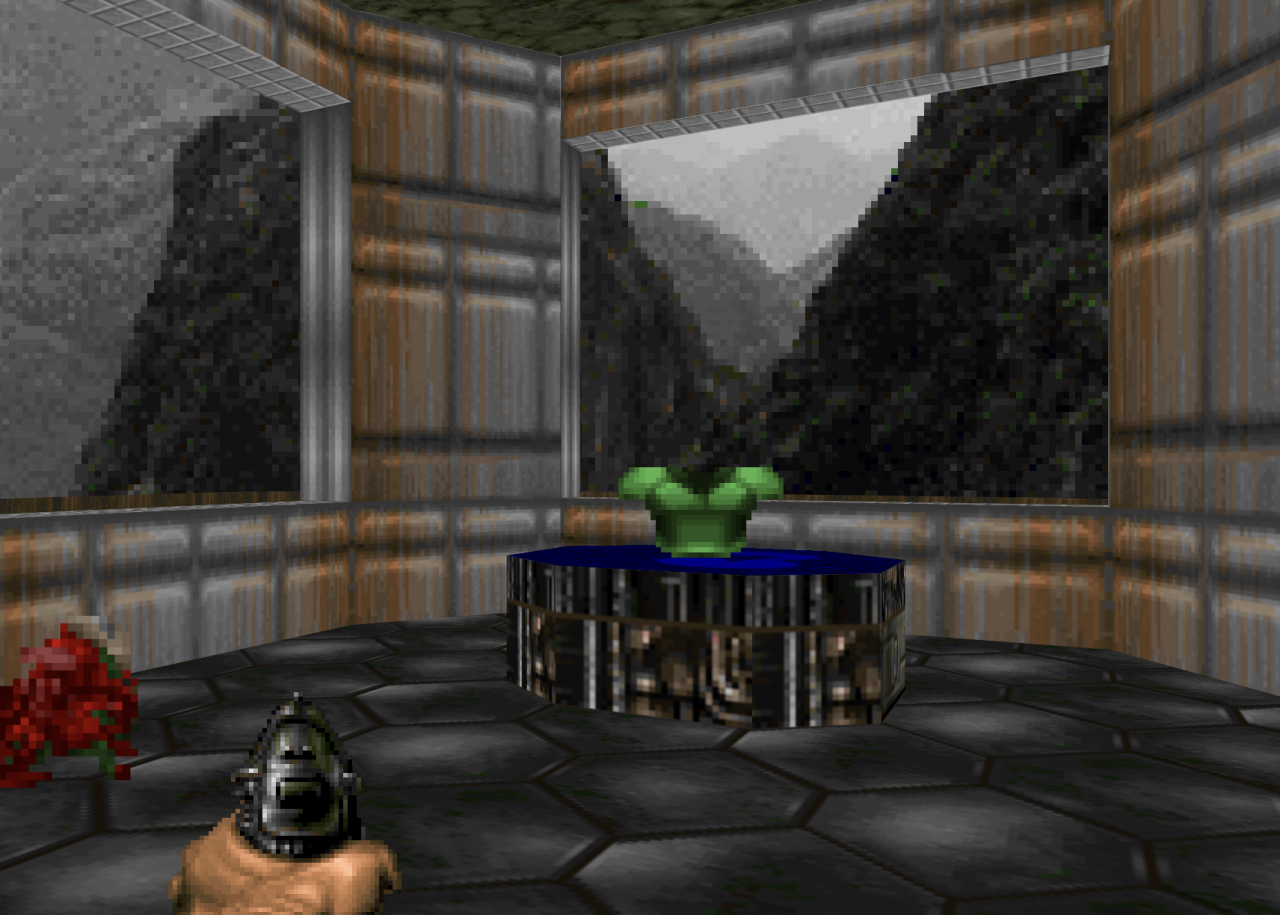
The 8 sided platform is sector with a raised floor with a polygon clipping path. The floor of the room itself is clipped by a SVG path, to get the cut out for the platform.
But here was one detail that I was not happy with and that is while polygon() uses percentages to define the polygon, the path() function needs to have all segments in CSS coordinate space. We tried so hard to keep CSS rendering details out of the JavaScript… Sigh.
But shape() to the rescue. This new addition to the platform allows us to write paths in a more natural language, use percentages AND evenodd fill. This is exactly what I was looking for. Now does this mean we can only do this with modern CSS? No. This has been possible for a while. I still am in awe by Keith Clark’s CSS FPS demo. Modern CSS just makes it a lot easier and more performant.
Lining up all of those textures
Texture tiling across adjacent sectors is another detail that took a while to get right. Two adjacent sectors that share the same floor texture should tile seamlessly across the boundary. Since background-image repeats infinitely, we just need to make sure every sector starts its pattern from the same reference point. By using world coordinates as the background-position offset, all sectors share the same texture grid — regardless of where each sector’s div happens to start.
At the left you can see two elements that have their texture aligned to the element itself, creating a clear break in the texture. At the right you can see two elements that use world coordinates for the positioning of the texture. There is a seamless transition from one element to the other.
But what are “world coordinates” and how do we tap into that? It sounds more completed than it really is. Let’s say we have a <div> that is positioned at the top at 400px and 200px at the left. We would set the background position to the inverse of that: -200px -400px. In our code this looks like:
.floor {
    background-repeat: repeat;
    background-size: 64px 64px;
    background-position:
        calc(var(--min-x) * -1px)
        calc(var(--max-y) * 1px);
}
Animating doors, lifts, and @property
Opening a door in DOOM means raising the ceiling of a sector. In CSS terms, that’s moving a bunch of elements upward. Rather than animating each wall and ceiling separately, I group them into a container <div> and animate the container’s transform:
.door > .panel {
    transform: translateY(0px);
    transition: transform 1s ease-in-out;
}

.door[data-state="open"] > .panel {
    transform: translateY(var(--offset));
}
The --offset is determined by definitions in the WAD file and defines how much the door needs to raise. Toggling the [data-state] triggers the CSS transition. No JavaScript animation loop needed. Opening a door is just setting a state attribute on the right element from the game loop. The CSS renderer takes care of the animation.
But there’s a catch. For lifts, the player rides along with the platform, so we need to update the --player-z position during the animation of the platform. But --player-z is managed by JavaScript and is based on information we get from the player state in the game loop. So we can’t really use a CSS animation for that. So for now we use a cubic ease-in-out (t² × (3 – 2t)) function in JavaScript to stay in sync with the CSS transition. That kind of works. Not really. But for now it is good enough.
@property --player-z {
    syntax: "<number>";
    inherits: true;
    initial-value: 0;
}
This @property declaration is what makes all of this possible. Without registered custom properties, you can’t animate or transition them — the browser treats them as strings. By registering --player-z as a number, we get a smooth falling transition when the player walks off a ledge.
Sprite animations and the mirror trick
DOOM’s sprites are 2D images that always face the camera — billboarding. Each enemy has sprites for different viewing angles: front, left side, back, and so on. The original game uses 8 rotation angles, but only stores 5 unique sets of frames. Rotations 6 through 8 are just mirrors of rotations 2 through 4.
Horizontally we have the sprites for walking. Vertically we have sets for the different angles. Rows 2 through 4 are mirrored when the player is walking to the other side.
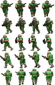
We do the same thing. JavaScript calculates the angle between the player and the enemy, maps it to one of 8 rotations, then picks a sprite row (0–4) and a mirror flag (1 or -1):
.sprite {
    background-position-y: calc(var(--heading) * var(--h) * -1px);
    transform:
        translateX(-50%)
        rotateY(calc(var(--player-angle) * 1rad))
        scaleX(var(--mirror, 1));
}
The rotateY makes the sprite face the camera. The scaleX handles the mirroring. And the walking animation? Each enemy has a spritesheet with the frames side by side. By default the sprite-cycle animation runs, which shifts background-position-x across the frames using steps():
@keyframes sprite-cycle {
  from { background-position-x: 0; }
  to { background-position-x: calc(var(--w) * var(--frames) * -1px); }
}
When an enemy starts attacking or dies, JavaScript sets a data-state attribute on the sprite. CSS picks that up and uses a different section of the spritesheet with different dimensions and frame count — the attacking or death animation. Clearing the attribute returns to original location. All the sprite definitions live in CSS, so adding a new enemy type is just a few lines of custom properties and data-state overrides.
One problem I ran into: all enemies were marching perfectly in step, which looked deeply unsettling. Every zombieman’s left foot hit the ground at the exact same moment. The fix is a random animation-delay set in JavaScript. When CSS random() ships in browsers, this can move to CSS too.
Projectiles, explosions and bullet puffs
Projectiles like rockets and imp fireballs are billboarded divs, just like sprites. But instead of updating their position every frame from JavaScript, we let CSS handle the movement. When a projectile is spawned, the JavaScript game loop calculates where it will end up if nothing stops it, and how long it should take to get there. The thin JavaScript renderer layer then creates a new DOM element, sets --start-x/y/z, --end-x/y/z, and --duration on the element, and the browser then fully automatically flies it from A to B using a CSS animation:
.projectile {
    rotate: y calc(var(--player-angle) * 1rad);
    animation: projectile-move var(--duration) linear both;
}

@keyframes projectile-move {
  from {
    translate:
      calc(var(--start-x) * 1px)
      calc(var(--start-z) * -1px)
      calc(var(--start-y) * -1px);
    }
  to {
    translate:
      calc(var(--end-x) * 1px)
      calc(var(--end-z) * -1px)
      calc(var(--end-y) * -1px);
  }
}
By using translate and rotate as separate CSS properties, the animation only drives the position while rotate stays reactive to --player-angle — so the fireball keeps facing the camera as the player moves. Meanwhile, the game loop still calculates the position mathematically for collision detection — the same linear math the animation uses. When a fireball or rocket hits a wall, a floor, a player, or an enemy, JavaScript game loop just removes the element mid-flight and spawns an explosion.
That explosion is a three-frame spritesheet animated with steps(), and the element removes itself when the animation ends — we just listen for animationend and call remove(). No cleanup timers, no manual bookkeeping.
Bullet puffs from the pistol and shotgun work similarly — a small spritesheet that plays once and self-destructs.
Lighting with filter: brightness()
DOOM stores a light level per sector. We set that as a --light custom property on a sector container, and everything inside inherits it:
.wall, .floor, .sprite {
    filter: brightness(var(--light, 1));
}
The CSS cascade is perfect for this — all walls, floors, and sprites in a dark sector are all dark, without setting brightness on each element individually. Flickering lights become keyframe animations on --light which is possible thanks to @property:
@keyframes light-flicker {
  0%, 4% { --light: 1; }
  5%, 8% { --light: 0.5; }
  9%, 50% { --light: 1; }
}
Invisible Spectres and SVG filters
There is one monster in DOOM that has an invisibility effect — a shimmering, transparent silhouette. We replicate this with an SVG filter applied via CSS:
.sprite[data-type="spectre"] {
    filter: url(#fuzz);
    opacity: 0.35;
}
The SVG filter uses feColorMatrix to create a black silhouette, feTurbulence for procedural noise, and feDisplacementMap to distort the pixels. The result is not quite the same, but close enough to the original effect.
Responsive DOOM and anchor positioning
The game is fully responsive. It works on a phone – maybe even a few minutes before crashing. Resize the browser window and everything adapts. The 3D viewport just fills whatever space is available — that part is easy. The tricky part is the HUD.
The original DOOM status bar is a fixed-width image. We split it into separate sections — ammo, health, face, armor, keys — each as its own element. On wide screens they sit in a single row, just like the original. On narrow screens the status bar wraps over multiple rows using flex-wrap. That means the height of the status bar varies.
And that’s a problem for the weapon sprite, because it needs to sit right on top of the status bar. If the status bar is one row tall, the weapon is in one position. If it wraps to two rows, the weapon needs to move up. This is exactly what anchor positioning is for:
#status {
    anchor-name: --status;
}

#weapon {
    position-anchor: --status;
    bottom: anchor(top);
    left: anchor(center);
}
The weapon anchors itself to the top edge of the status bar. No matter how tall it gets, the weapon follows. We use the same technique for the touch controls on mobile — the joystick, fire button, and use button all anchor to the status bar as well.
Spectator view
There’s a spectator mode that lets you zoom out and see the entire map from above. You can pan around, rotate, zoom in and out. And there’s a follow mode that puts the camera behind the player, like a third-person view.
What I like about the follow mode is that the camera position is computed entirely in CSS. The camera needs to be positioned behind the player, at a certain distance and height. “Behind” depends on which way the player is facing, so we need sin() and cos() to calculate the offset:
body.spectator.follow-mode #scene {
  --follow-dist: calc(var(--follow-height) * 0.7);

  translate: 0 10vh var(--perspective);
  rotate: x -55deg;
  transform:
    rotateY(calc(var(--player-angle) * -1rad))
    translate3d(
      calc(
        (var(--player-x) + sin(calc(var(--player-angle) *
        1rad)) * var(--follow-dist)) * -1px
      ),
      calc(
        (var(--follow-height) + var(--player-floor)) * 1px
      ),
      calc(
        (var(--player-y) - cos(calc(var(--player-angle) *
        1rad)) * var(--follow-dist)) * 1px
      )
    );
}
The standalone rotate transform rotates the camera so that it looks down at the player. Without it the camera would look be level with the horizon and not even see the player. And the 10vh translate shifts the player a bit down, so we can see more of the scene in front of the player.
And because they are all standalone properties, they now transition separate too. I used combined transforms before and the camera would make a really weird arc in the transition from FPV to follow mode. But after changing it to standalone properties it is just really, really smooth. The camera goes from eye level to looking down in one seamless motion while we fade in the player sprite and fade out the ceilings.
JavaScript doesn’t do anything special here. It just sets --player-x, --player-y, and --player-angle from the game loop as it always does, and CSS figures out where to put the camera. The only thing JavaScript handles in follow mode is the zoom level by setting the --follow-height custom property.
The difference between the regular first-person view and our spectator view? Just a class that overrides our transform with some different math and hides the ceilings. The rendering is a detail handled by the CSS. Same 3D scene, same elements, just a different transform on the container.
The culling problem
Performance is the elephant in the room. We’re asking the browser’s compositor to deal with thousands of 3D-transformed elements, which is asking a lot. Large maps can overwhelm the browser. And it is not just that the browser runs slower and movement becomes stuttery. Safari on iOS just crashes if it is becoming too much. So we cull — we hide elements that are outside of the perspective frustum.
You’d think the browser would do this automatically. It knows the perspective, it knows where each element is in 3D space — it could just skip rendering elements that are behind the viewer or outside the field of view. But it doesn’t. Browser compositors simply aren’t optimised for 3D scenes like this. They were built for layered UI, not for thousands of surfaces in a 3D world. So we have to do it ourselves. Fair enough, it would probably be a waste of resources for browsers to optimize for these scenarios.
The default culling approach is JavaScript-based: every few frames we check each element’s distance and whether it faces the camera. If it’s behind the player or too far away, we set hidden on it.
But the more interesting version is the experimental pure-CSS culling. For each element we calculate whether it is in front of the player and within the field of view. If it’s not, it should be hidden.
The problem: CSS can compute a number – 0 for visible and 1 for hidden – but you can’t directly use that number to set visibility. There is a new feature coming to CSS that solves this: if(), but right now it only just shipped in Chrome.
So I used a trick called type grinding. You create a paused animation that toggles visibility between visible and hidden. Then you set the animation-delay based on the computed value to determine which keyframe is used:
animation: cull-toggle 1s step-end paused;
animation-delay: calc(var(--cull-outside) * -0.5s);

@keyframes cull-toggle {
  0%, 49.9% { visibility: visible; }
  50%, 100% { visibility: hidden; }
}
A negative animation delay on a paused animation jumps to that point in the timeline. So a delay of 0s lands in the visible range, and -0.5s lands in the hidden range. It’s a hack, but a functional one. When CSS if() gets wider support, we can replace this with a clean conditional.
Depth sorting
The browser handles depth sorting surprisingly well. DOOM’s 2.5D geometry — a 2D map with vertical walls and horizontal floors at different heights, ensures that we don’t have any intersecting planes. But even when we have sprites moving through walls or floors, the browser splits them at the intersection line. This just works.
The one problem is coplanar surfaces. When a bullet or fireball hits a wall, the impact sprite spawns at the exact same position as the wall surface. Two surfaces at the same depth fight for visibility, sometimes causing flickering. At other times the bullet hit is not visible, or partially cut off. The fix is simple: we position the effect slightly in front of the wall. It’s a small offset, small enough to be not noticeable and large enough to ensure that the bullet impact or fireball explosion is visible.
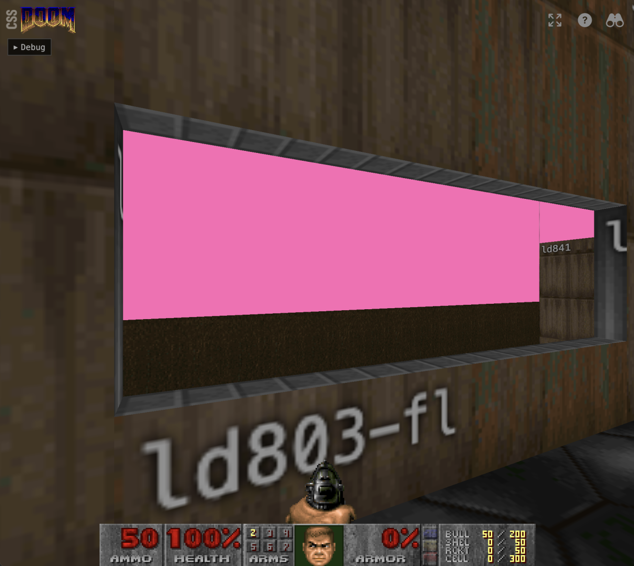
Where DOOM just cheats
One of the big differences between DOOM and our CSS renderer is the way we project the sky texture. Inside of the map data we have sectors with walls that are marked to have sky above it. Let’s call that sky “walls”. In the image below you can see these walls as pink. The renderer then just draws a 2D sky texture in onto that 3D wall. It doesn’t give the 3D wall a texture in 3D space. No it draws it in 2D, which it can do because it is rendering 3D as 2D. Just a quick hack.
But we can’t do that. We’re projecting a true 3D scene. And that means we can’t arbitrarily show the sky texture in 2D in our 3D scene. What we do instead is have our 2D sky behind the 3D scene. And that works… unless it doesn’t.
It doesn’t because DOOM cheats. Sometimes it shows the sky “walls” when there is actually real map geometry behind it. So the sky sits in front of a different portion of the map. And we show the sky behind the map. So we can see parts of the map that you aren’t supposed to see.
Initially I wanted to calculate a clipping path in the shape of the pink walls, but they you also have to take into account that the player is looking out of windows and the calculations become really complicated really quickly.
The solution was to add another step to the culling algorithm. It checks if an item is behind a sky “wall” from the players viewpoint, and simply set the hidden attribute on it if it is. So the sky “walls” don’t block the item in 3D space, but they do block the items from rendering.
Was it worth it?
What I set out to do is create something that pushes boundaries of what is possible with CSS. Ideally I would have done this whole project in CSS, but that is not feasible at the moment. Yes, Lyra Rebane build a x86 CPU completely in CSS, but that technique is simply not fast enough for handing the game loop. So the result is something that uses a lot of JavaScript. And that game loop is honestly the least interesting part of the whole project. It’s “only” an approximation of the original DOOM code, adapted for the browser. There is really nothing new or creative about it.
The interesting part is the renderer. The scene is just some HTML elements and the rendering is completely done in CSS, from 3D projection and sprite animation to moving mechanics such as lifts, doors and projectiles – the JavaScript game loop only gives the CSS some new coordinates and then lets CSS deal with updating what the user sees. A strict separation of concerns.
And it works well. It works way better than I ever expected. But of course, it won’t replace a proper WebGL or WebGPU renderer. Performance is limited. But that’s not the point. This is about pushing the boundaries of what CSS can do. Trig functions, @property animations, clip-path, SVG filters, anchor positioning — these are all production-ready CSS features being used in ways their spec authors probably never imagined.
We also ran into a few browser bugs along the way. View Transitions in Safari completely flatten preserve-3d — during the transition the browser captures the scene as a 2D snapshot, so the entire 3D world goes flat. And setting background-image via a CSS custom property (e.g. background-image: var(--texture-image)) causes severe issues in both Safari and Chrome. When every frame the browser re-resolves all var() references on every element, triggering massive re-rasterization of thousands of textures. The workaround is to set background-image directly as an inline style. Chrome’s compositor also has general instability with this many 3D-transformed surfaces — textures occasionally disappear during gameplay in ways that don’t happen in Safari or Firefox. And also a @starting-style transition of opacity in combination with display: none on a 3D position element seems to trigger the transition continuously in Safari. So many weird bugs. I’ve got some bug reports to file.
And if nothing else, it answers a question nobody asked: can CSS run DOOM?
Yes. Yes it can.